
SixFifty removes the complexity and mystery from creating legal documents for business owners and HR professionals.
The Problem
When I joined SixFifty, the app was in an advanced beta. They had proven their business model and they had happy paying customers. To grow the app needed a UX facelift. It also needed to be re-written in newer technologies.
p.s. Product, design and engineers were all new employees.
p.s.s. This project took over a year of full-on scrambling to pull off (this was an incredibly complex piece of software).
p.s. Product, design and engineers were all new employees.
p.s.s. This project took over a year of full-on scrambling to pull off (this was an incredibly complex piece of software).
Considerations
- We needed to integrate a new visual brand
- The UX and accessibility of the app was sub-par and needed a bunch of work
- The UX and accessibility of the app was sub-par and needed a bunch of work
- The Engineers needed to rewrite the software while they continued to fix bugs and create new features.
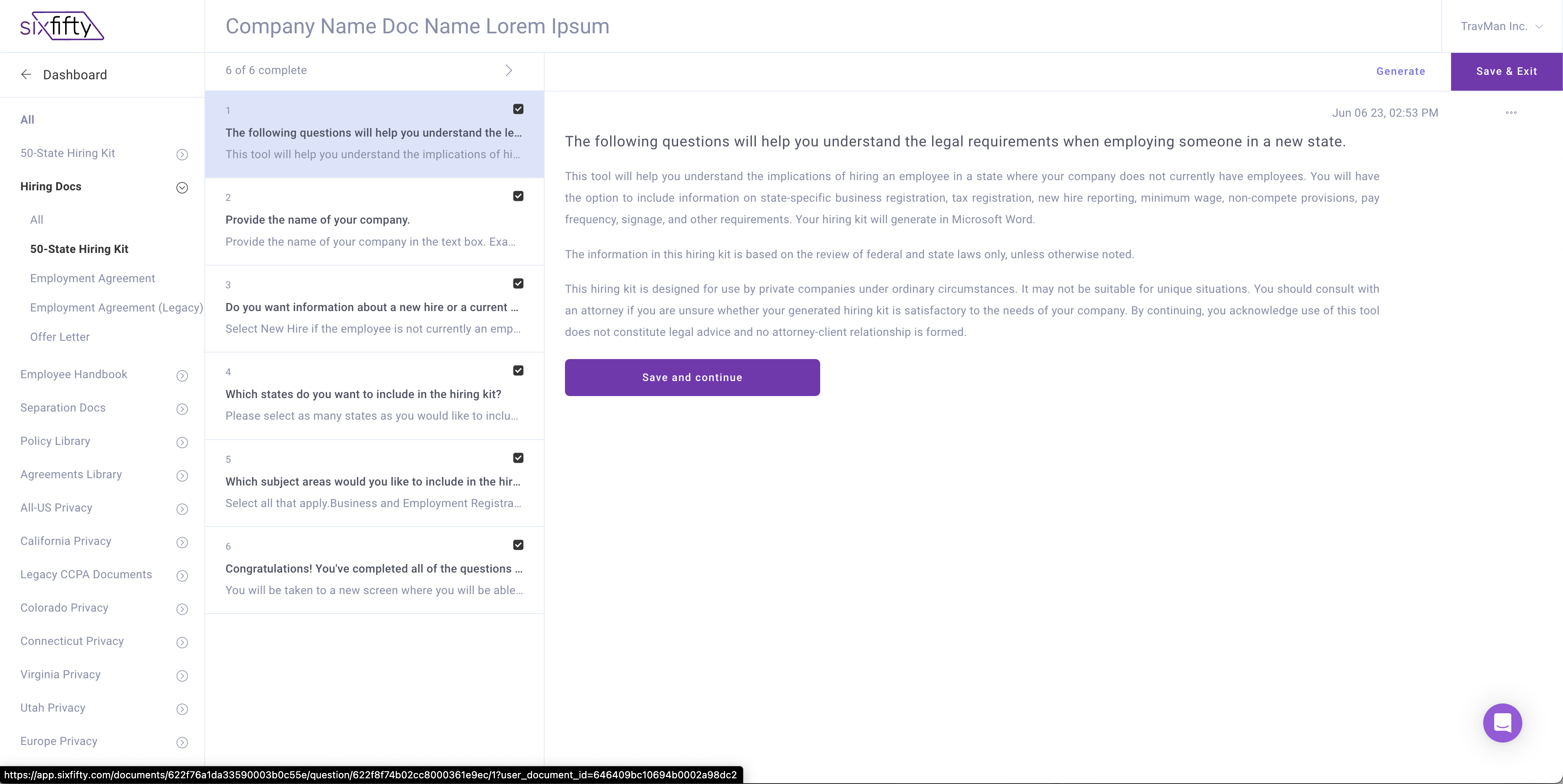
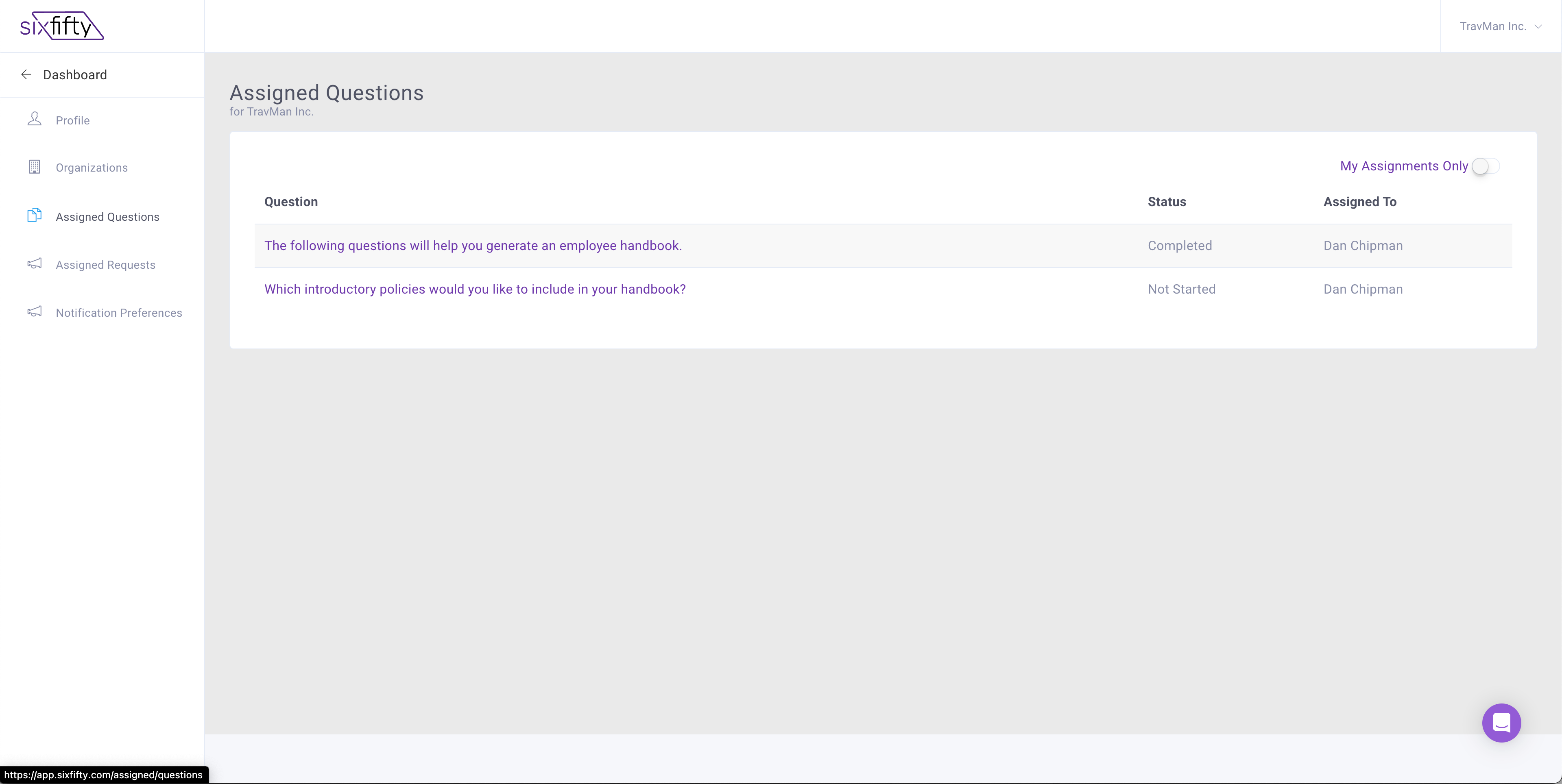
Application Audit
The first thing I did was go through the entire site, take screen shots, mark them up and present to the stakeholders. Here is what I found:
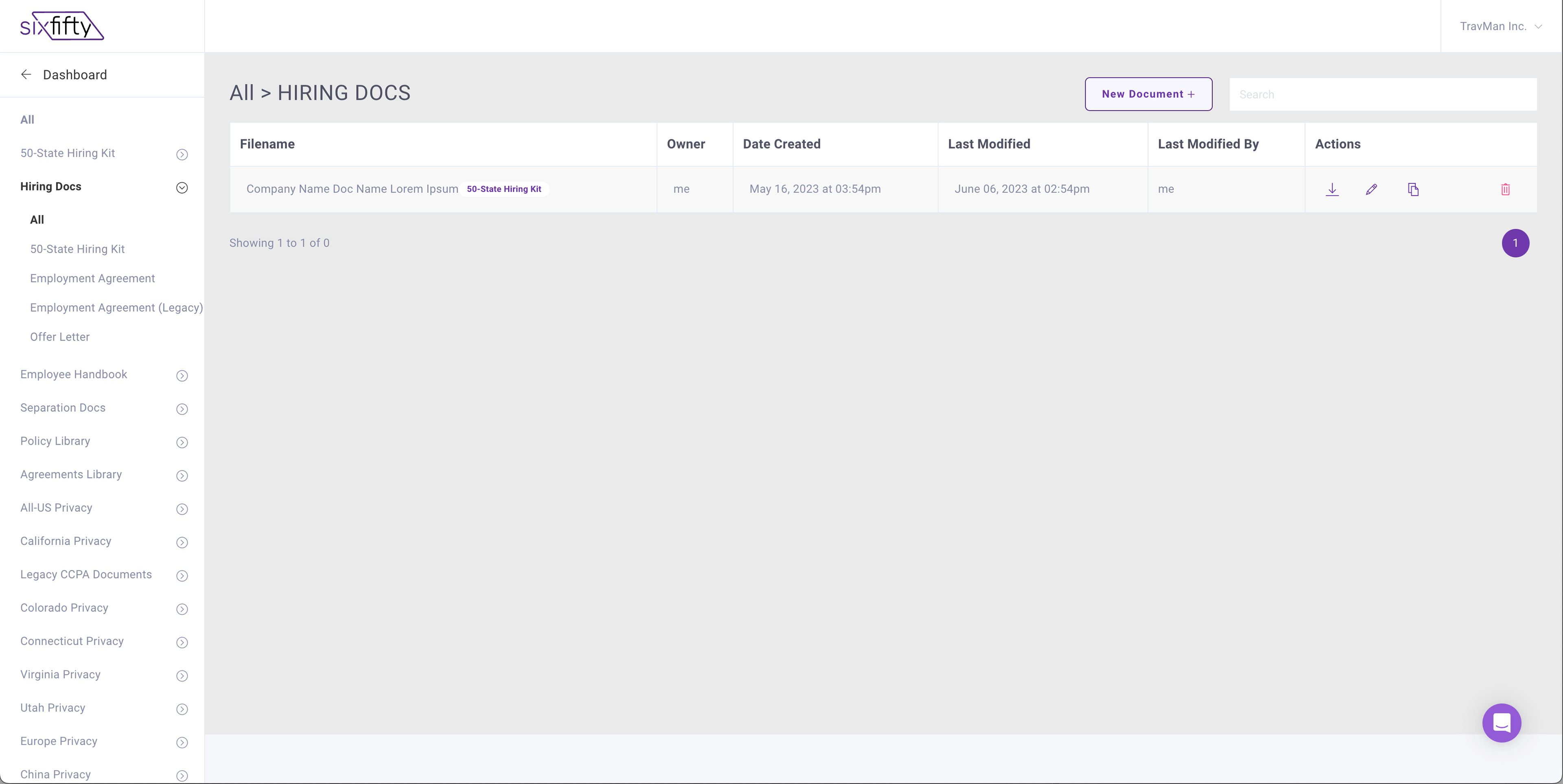
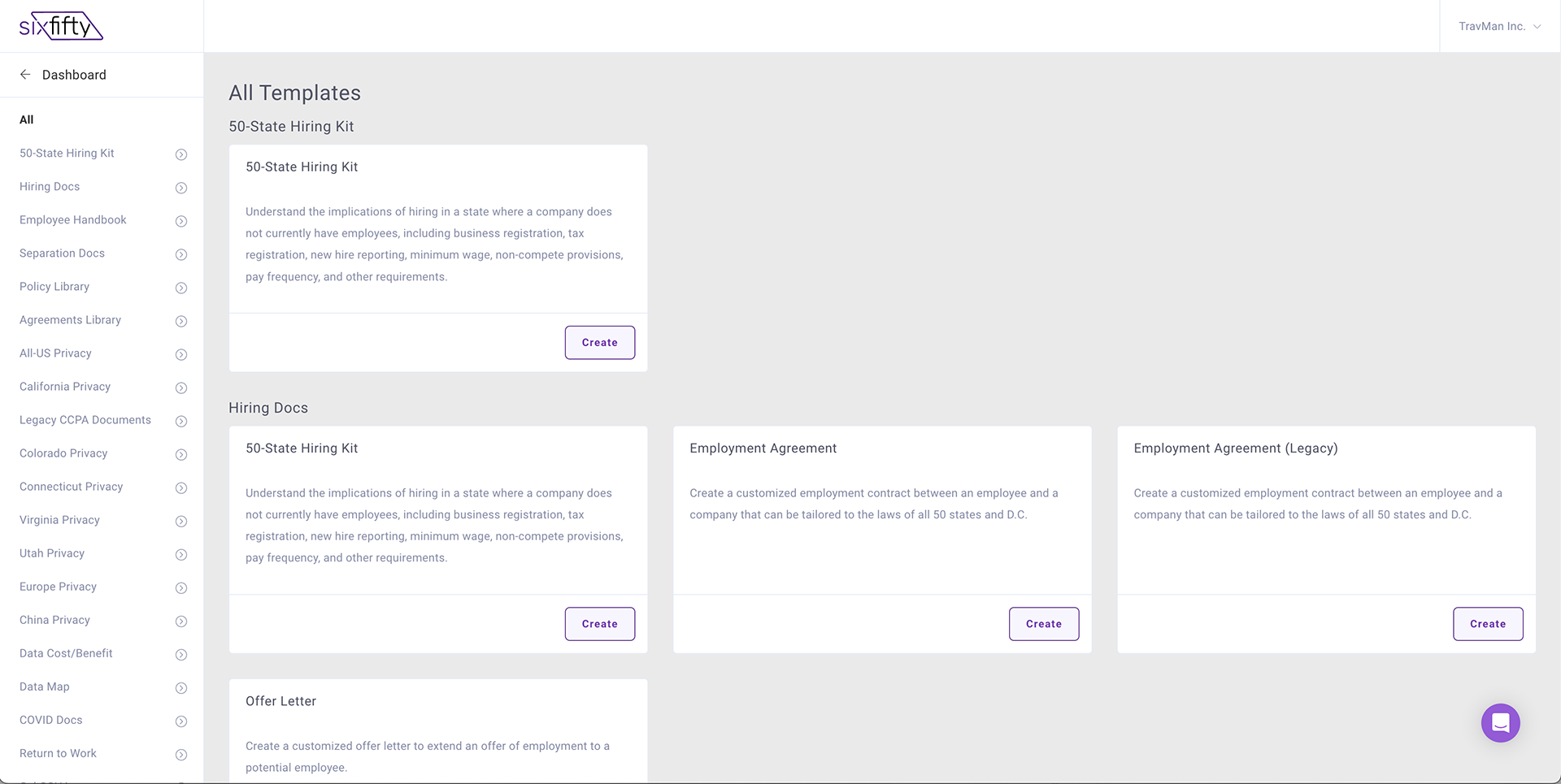
- There were clear navigational hierarchy problems. The user had to hunt and peck for everything but new document templates including: their previously created docs, profile, settings, customer support and training just to name a few
- There were clear navigational hierarchy problems. The user had to hunt and peck for everything but new document templates including: their previously created docs, profile, settings, customer support and training just to name a few
- When the user navigated away form the dashboard (that was empty for most users) they were presented with a different navigation
- It was almost impossible to find other features in the app
- There was a vanilla "design system" in place that didn't fit the brand of the company
- Icons were used over and over for different features. Visual communication was poor
- Accessibility was poor. There was generally not enough contrast in anything. There were not ways for the user to tab around the page. The links, buttons and inputs did not have proper focus states etc, etc.
Below are just a few of the screen shots I took. Click on them to see a larger view.
Below are just a few of the screen shots I took. Click on them to see a larger view.
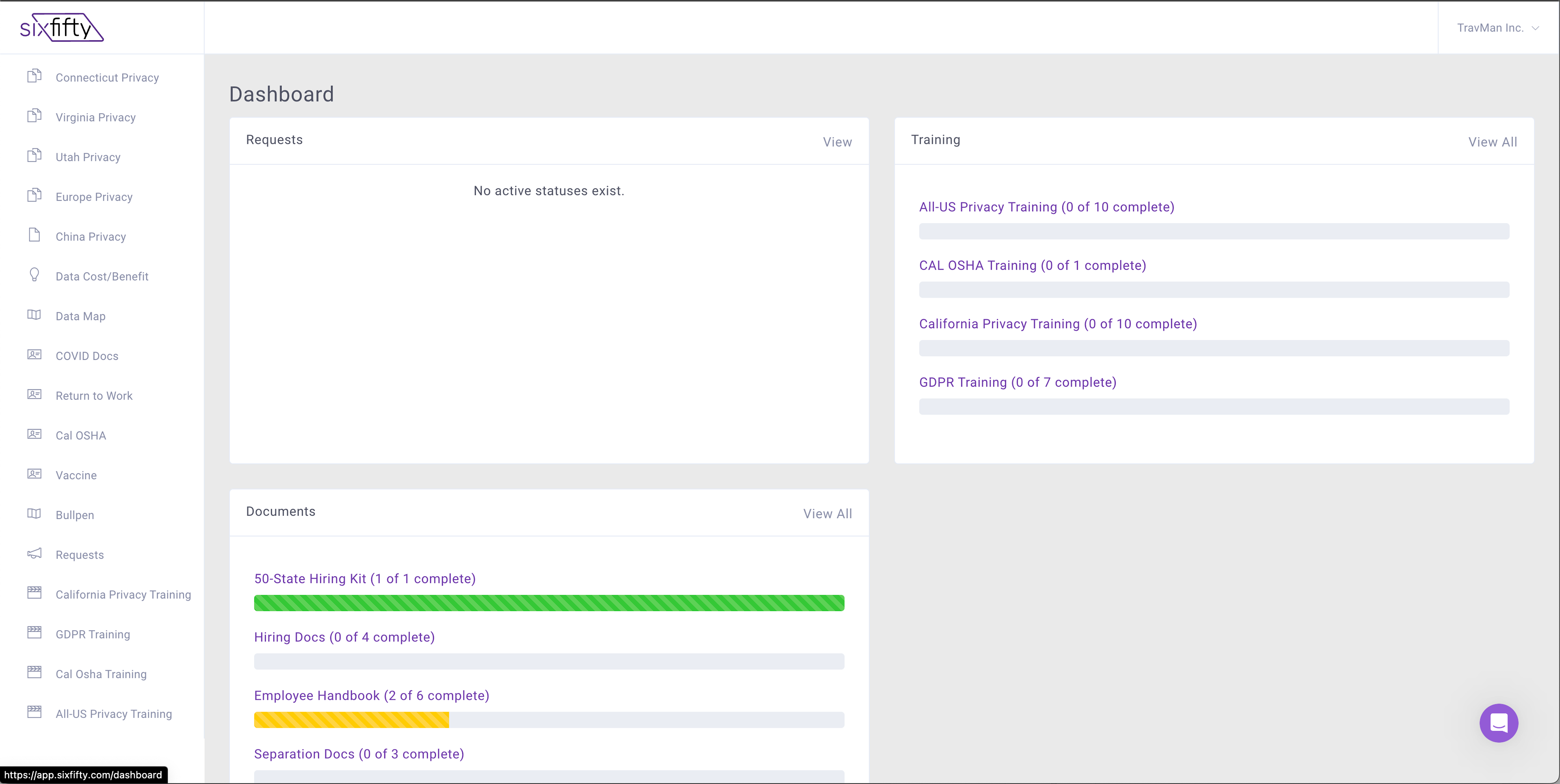
Document Dashboard
Where To Start?
At the beginning of course. I needed to truly understand how the software functioned. It was actually incredibly robust but needed to be honed so that all the great technology could be used. I sat with the Head of Product, Engineers, CEO, CS and users to get a deep dive.
Then with some help from marketing I was able to better understand the customer. We determined that our customer demographics looked as follows. We created personas to help us quickly identify how a feature would impact certain users.
Then with some help from marketing I was able to better understand the customer. We determined that our customer demographics looked as follows. We created personas to help us quickly identify how a feature would impact certain users.
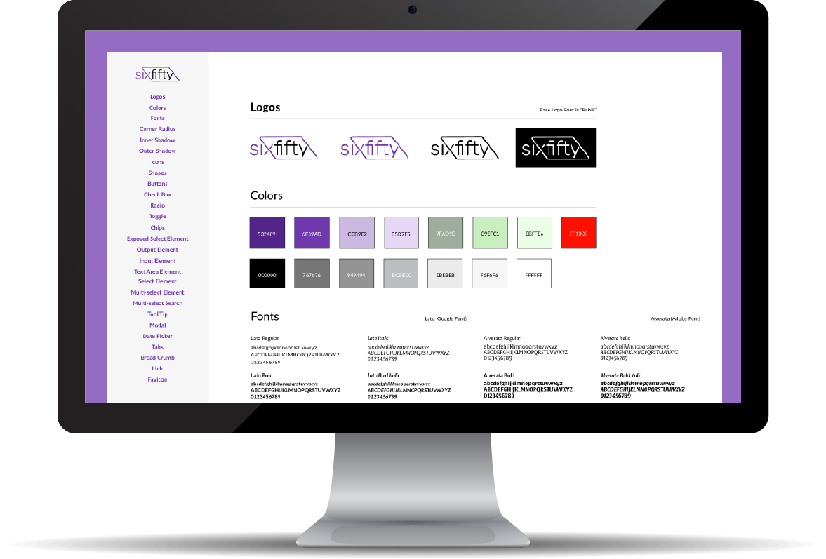
When the audit was complete I dove into the new Brand Guide. I noticed off the bat that we needed to tune up the color palette for contrast, simplify colors and use fonts that were readily available for use on the web. After that was approved we started to build the new SixFifty design system. We used Brad Frosts Atomic Design Methodology to build the design system and it worked wonderfully.
I partnered at least daily with my front-end counterparts (shout out to Big Ben). All along the way I gathered feedback on my designs and made revisions to try to mitigate changes in development.
A couple of things to note is that I initially designed this in XD (don't hate). I later moved it to Figma really for my own benefit as the code was our source of truth. Also as we know, design systems require ongoing work so I updated it almost daily.
Here is that initial work.
The Outcome
Each time we released we gathered feedback with the help of the CS team and further tweaked the experience. We honestly heard so many good things from our users as team members from CS, Sales, Legal and Product engaged with them.
I really feel like this design system set the foundation for a greatly improved user experience. The short term benefit was that it helped us get off the old system faster because engineers could take a stab at new pages while I was working on the really big products that needed love. The long term benefit was that it set us up to quickly introduce new products and features. This eventually lead to the acquisition of SixFifty by Paychex. Yay Stock options!
Looking back It was one of the huge wins of my career.
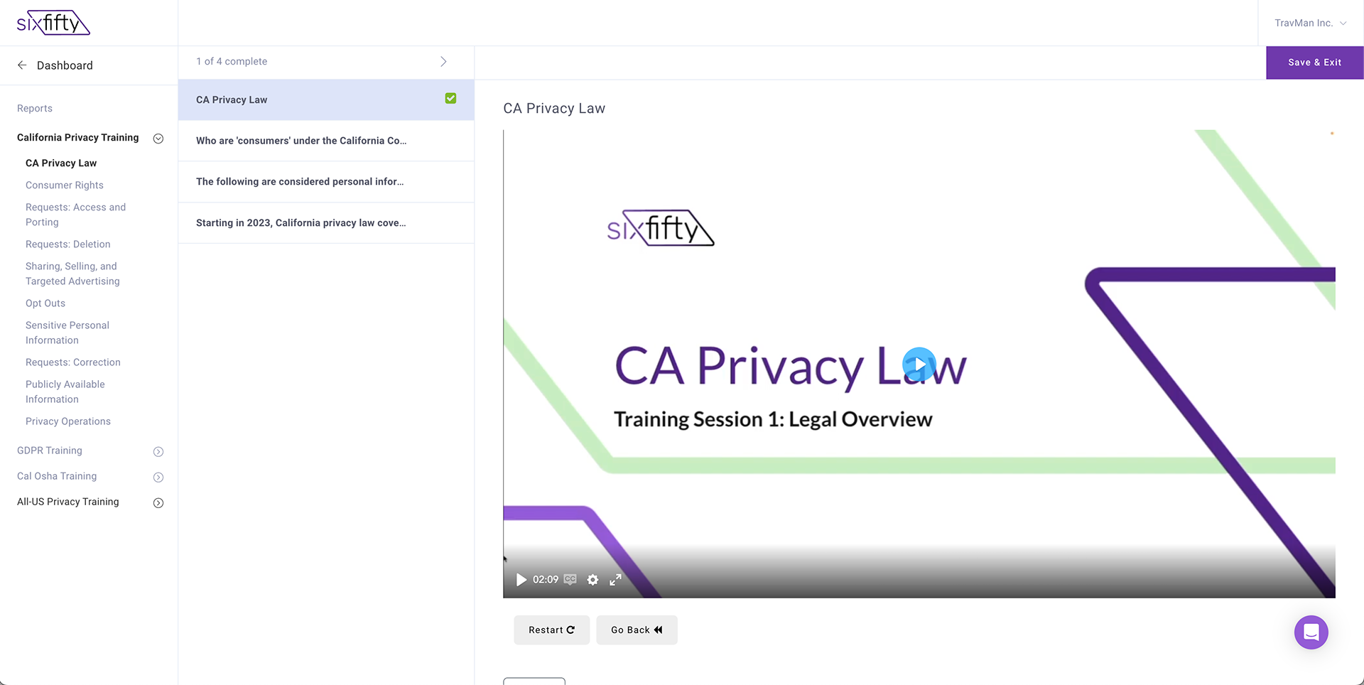
Below is a video of the software as it sits today. I left the company November 2024 most, but not all of what you see is my design. Shout out to all those that helped.
Looking back It was one of the huge wins of my career.
Below is a video of the software as it sits today. I left the company November 2024 most, but not all of what you see is my design. Shout out to all those that helped.